 April 2014
Website Updates
This is a major new version of Kin Corning Photography. At first
glance the site may not look much different, but a lot has changed.
In terms of content, I have reduced the main image galleries to a few simple
categories. Weaker images are gone from the site, and there is a lot of new material.
The major changes, however, are in the underlying technical infrastructure and
the adaptation of the site for mobile touchscreen devices. The growing array of Internet-enabled phones
and tablets has added significantly to the challenges of web programming. Screens designed for a computer
may fit poorly on a small display, alternatives must be found for Flash which is unsupported on Apple iPhones
and iPads, dealing with touchscreen gestures requires a different kind of software programming, and the
challenges continue along these lines.
The biggest such challenge arises from the new generation of high-resolution
devices such as Apple’s Retina iPads and MacBook Pro laptops. The clarity of these displays
is remarkable, but they unfortunately are not friendly to traditional websites. Text or anything else
rendered by the web browser is exceptionally clear, without the slightly-soft or jagged edges of web text
on a traditional computer screen. The problem is that web images and graphics are rendered in the same
physical space on the web page, but over 4x the number of pixels (dots) as on a traditional computer
screen. If a web image targeted for a traditional display is sent to a Retina device, it will
effectively get upsized by the browser, causing it to appear blurry.
As of this writing at least, this is a problem you will see on many if not most of
the websites you visit with your Retina device, because relatively few sites have taken the time
and effort necessary to address it. Programming is required to detect a high-resolution display
and to tell the web programs how to respond, and then every image needs to be prepared in
multiple versions, once for traditional screens and again for different types of high-resolution
device. It is these changes that constitute the biggest update in this version of Kin Corning
Photography: In addition to the web programming, every image on the site has been re-prepared
in multiple versions—nearly 1000 individual image files in total.
Having committed the time to these changes, at least I can say I am pleased with
the result. If you have a Retina iPad or other such device please do use it to browse the site.
The images and other content really do look noticeably better than they do on a regular computer.
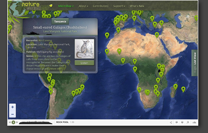
Supporting these changes, I have added some related touchscreen functionality. On
the gallery and individual image pages, you can swipe from one page to the next if you prefer that to
using the arrows. Many websites revert to alternative mobile versions, but I am not a fan of that
solution. Instead, I dynamically change page layout where required, so that things fit cleanly on at
least the iPad and iPhone screens (these being the devices I most often see hitting the site). On the
iPhone things are a little fiddly due to the small screen size, but it does all work if you pinch-zoom so
you can more easily select the links. Once you are in individual image display mode it is easy to swipe
backward and forward among the photographs.
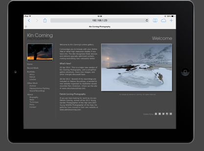
I have also been doing the web programming for my son Patrick’s website,
which is now released in a new completely-refreshed version. Like this site, it is enhanced for Retina
screens and touchscreen gestures. Have a look at his work at www.patrickcorning.com.
The final challenge for web development in today’s world is testing. In the
pre-mobile era, a fairly comprehensive job of testing could be done with a selection of web browsers on
each of Mac and PC computers. Now, there are countless individual devices that are web-enabled, and it
is quite impossible to test on all of them, particularly for an amateur developer like myself. I have
tested the site on several generations of iPads, iPhones and iPods, but I have been unable to do much
testing at all on Android devices. I would not be surprised if there are problems on certain devices, and
I am therefore very appreciative of any reports of issues you may encounter—please make reference
to the device/model you are using, the browser, and if possible software version numbers.
|

